
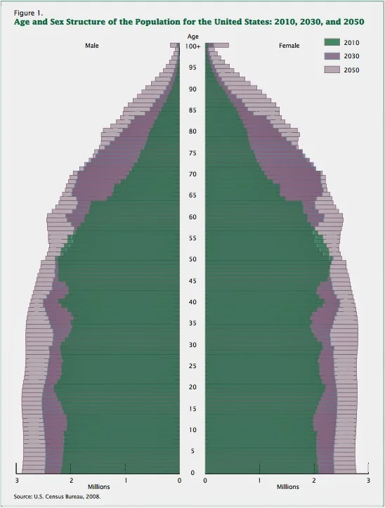
The venerable U.S. Census Bureau produced this great year-by-year 'age pyramid graph, showing the population structure in 2010 along with estimates of the population structure in 2030 & 2050. These predictions are probably very accurate, especially at the top of the pyramid.
As you can see, the purple (2030 estimate) bars for people of ages from about 62-82 are up to double the width of the green bars, indicating actual 2010 census data.
I.E., between 2010 and 2030, the number of Americans in their 60s and 70s will roughly double. During that period, the number of people under 55 in the U.S. will increase only about 15%.
That purple 'Baby Boomer Bulge' indicates a huge increase in sexagenarians (I love that word) and septuagenarians between now and 2030. That's the heart of the mature consumer market that we're obsessed with here @BrandROI. But in percentage terms, the increase in the population of very old people (85+) between 2030 and 2050 is even more striking. That has implications for the 'dependency ratio', which is the topic of a lot of hand-wringing and doom-saying. I'll address some of those concerns in a future update to Daily Factoid.